

Kensington Homes unveils refreshed brand and modernized logo
Summary
- Kensington Homes has launched a refreshed brand identity and updated logo.
- The new look focuses on clarity, inclusivity, and digital-first design.
- The rebrand balances the homebuilder’s long-standing legacy with a future-focused vision.
 Winnipeg, MB – Kensington Homes has introduced a refreshed brand identity and a new logo designed to reflect the company’s evolution while staying rooted in the familiarity homeowners know and trust.
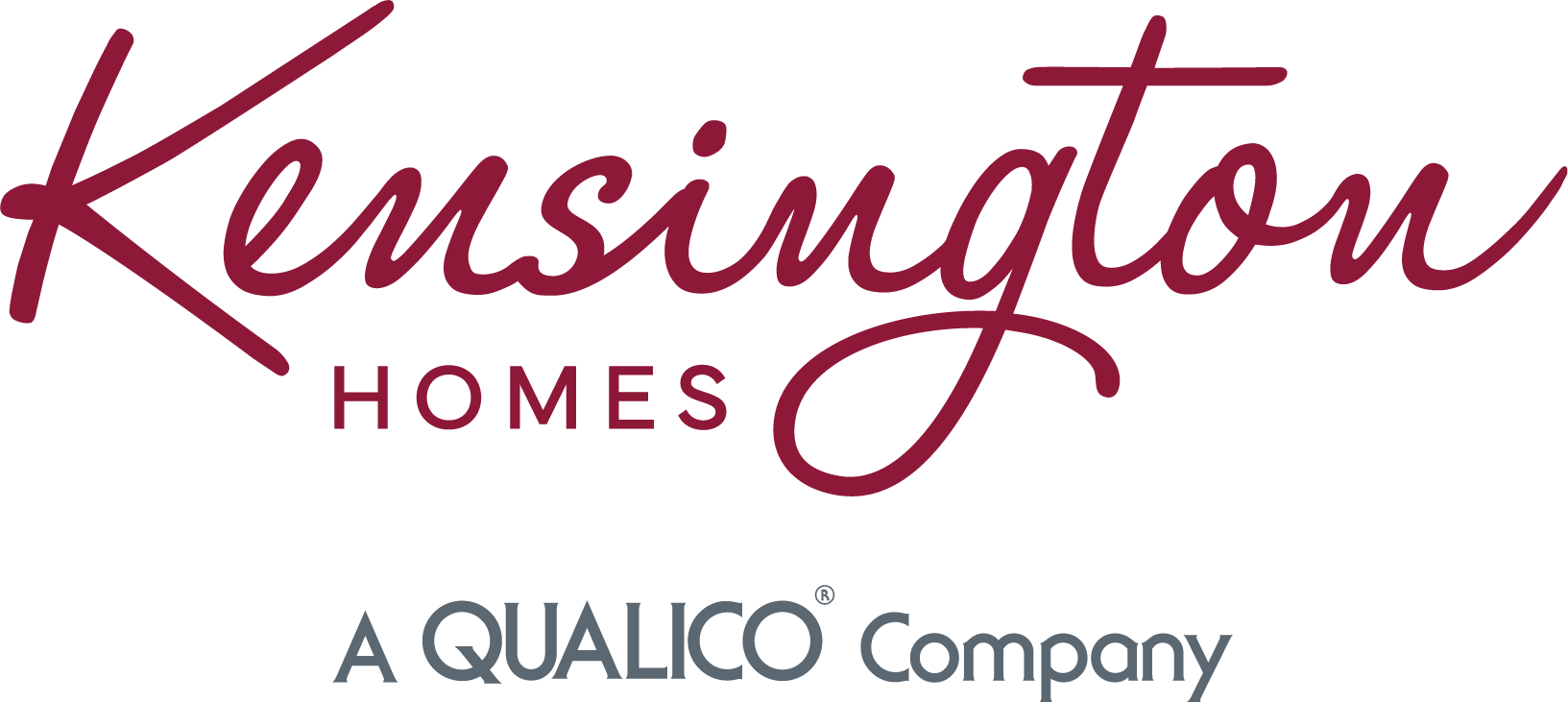
The rebrand centres on a modernized logo that is cleaner, easier to read, and more adaptable across digital platforms, marking an important step for the Winnipeg-based homebuilder as it continues to grow in a changing market.
“We wanted to refresh our brand with a modern look while still staying true to our logo evolution and our familiarity in the market,” said Courtney Eismendi, Marketing Specialist, Kensington Homes. “As our community grows and evolves, it was important for us to ensure the Kensington Homes name is recognizable to everyone, including new Canadians and younger generations.”
A key driver behind the update was functionality. The previous logo was less suited to today’s digital-first environment, where brands must perform well across websites, social media, and mobile platforms. The new identity improves legibility and consistency while expanding Kensington Homes’ suite of creative assets.
“Our new look ensures the Kensington Homes name is easier to read and accessible to all our customers. That accessibility was a major focus throughout the process.”
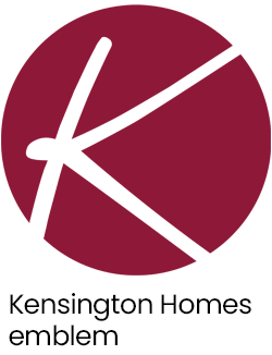
 The new logo bridges Kensington Homes’ decades of experience with its future-focused mission in homebuilding. The refined typography and updated colour palette signal inclusivity and approachability, reinforcing the homebuilder’s commitment to helping every Canadian find a home that fits their family and lifestyle.
“It reflects our core value of inclusivity. We want every customer, regardless of background or primary language, to easily identify with the Kensington Homes brand and feel confident connecting with us.”
Throughout the design process, maintaining brand equity was critical. The team worked through multiple creative perspectives to ensure the result felt like an evolution rather than a departure.
“Our primary goal was to make sure the brand still felt like ours. It wasn’t just about a visual change. It was about securing an identity that will lead Kensington Homes for years to come.”
 The rebrand also aligns with Kensington Homes’ strategic focus on attainable modern living. This includes the continued expansion of its Value Series, which offers affordable homes without compromising on style or quality, and supports a more diverse range of homeowners, from first-time buyers to new Canadians.
“Our goal is to bridge the gap between our trusted legacy and a more modern, stylish future. We want the refreshed brand to send a clear message that Kensington is for everyone.”
By modernizing its identity, Kensington Homes is strengthening its alignment with Qualico’s commitment to building high-quality homes, positioning the homebuilder for continued success in a competitive, design-conscious market.

Published: February 2026

Published: February 2025

Published: February 2024

Published: February 2023

Published: January 2024
Published: June 2021
Published: February 2026
Published: February 2025
Published: February 2024
Published: February 2023
Published: January 2024
Published: June 2021